aerial photo of Wellington showing site location
Empty sections are difficult to find in the centre of Wellington – particularly for those with a limited budget. We think we did well with 160 Raroa Road: just over 600 square metres area, within walking distance of the city centre (its just over the hill to the east). The fact that the site is steep (up to 45° in places), with limited early morning winter sun exposure, and very exposed (our wind classification is ‘very high’ – but then most of Wellington shares that category…) was seen as an ideal opportunity for an architect who has been designing web-sites for the past 10 years (the PROFESSION of Architecture having become too much of a pain to deal with).
My initial response was to design a platform in the air, positioned as high on the site as possible to maximise early morning sun, and to keep as far away as possible from the not-so-pretty neighbour to the north.
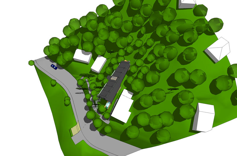
Whatever its merits, the platform design hit problems with the District Plan’s site shadow angles requirements – which were exacerbated by the steep site. Further doodling resulted in a long, thin building which stepped up the slope, all contained within the prescribed shadow-angle envelope.
Key influences on the design were:
- the fore-mentioned shadow angles (possibly the prime generator of the form of the building)
- the usual site-generated constraints (views, slope, wind etc)
- no (or very, very little) digging into the slope – we want our patch of land to be kept as stable as possible
- the need for a pre-fabricated design solution (possibly the only way to prevent blow-out construction costs in a climate such as Wellington’s, and with the terrain’s accessibility problems)
- use of a limited, ultra functional palette (‘cos we like it that way)
- multi-purpose functionality: where possible building elements are designed so that they take on more than a single function or purpose
- we want to be warm and comfortable without effort
- glare needs to be controlled (Wellington suffers from an excess of sunlight at times – difficult to control when you have a view and work on computers alot)…
- the need to some-how “future-proof” the design. Thermal efficiency and passive energy systems need to be integral to how the spaces will be used, and be ready for alternative energy sources as they become more affordable
- and most importantly, multi-purpose spaces which we can reconfigure as we see fit – we plan to use much of the main space as studios and workshops where we can throw paint around or operate a power saw… AND simultaneously be capable of absorbing our growing artwork and modern furniture collection…

birdseye view of the site