looking up from raroa road
We’re forced to use off-site parking – we’ll be leasing a bit of the road reserve from council and building a simple card-deck for Jacque, our Citroen BX (maybe even a carport if the council let us). Raroa Road is busy, but the shape of the bluff between the site and the road should block out much of the road noise. Access to the site is via a pleasant, mossy (read potentially slippery) paved path on the public road reserve.
The design is configured so as to give us a “shopping-list” of sorts – to suit our budget and builder match-up: the Wellington building industry is humming at the moment:
- BASE MODULES (the minimum habitable configuration), consisting of the first three modules, entry on-axis. Building costs will have to be something like (I’m guessing here) NZ$3,000/ sq. m. for the project to be this small (average building costs in Wellington lie just below NZ$1,000/ sq. m.)
- ENTRY from above – on axis, less expensive option (not shown in the current scheme drawings)
- ENTRY from below – our preferred entry option, as the entrance is more dramatic:
— you get to sniff the roses
— enjoy the view
— the interior gets an interesting break in the rhythm of the modules as they march up the hill
— most importantly, it allows us to break the main space into two potentially separate entities (say a gallery / studio / office to one side, something entirely different on the other) - EXTRA MODULES – the remaining modules
- LAP POOL – more like a reflecting pool for the moment (unless I can find a little more width – I’d ideally like a width of around 2m so that you could do a full breast-stroke without scrubbing the side walls)
- ELEVATOR/HOIST – this one could potentially be very useful for the builder, but remains one of the last things we’d opt for, unless I can find a simple (read inexpensive) way of doing it myself. A formal cable car solution would cost $30k to $40k – too much money for too little gain as far we are concerned. I have this vision of us using a couple of Segway Human Transporters to get around town, and simply driving the Segway onto the hoist and up…
I’ll settle for a device that can lug up the groceries and stuff (maybe one person if they are feeling adventurous enough).
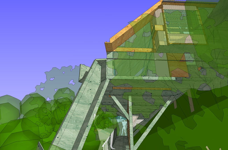
southern boundary view towards entrance
In the image above the beam-thing that angles in from the lower left is (diagrammatically) the elevator/hoist contraption. As configured it starts just before the public access path turns into a long flight of stairs, and inclines directly to the main floor level. It could just as easily start from the bottom of the access path (at the bottom-most part of our land) and rise up to the main level (adjacent to module 4)… it’ll work itself out in the wash.
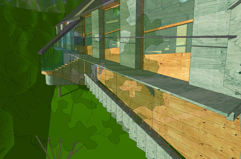
lower access route and lobby from south west
Our preferred entry option is via the lower “garden” route – shown here. There are only a couple of trees on the site (most flora being of the very-large-bush variety), and one of them shaves the structure at this point. As the building is lifted off the slope on poles, we have the dark under-cavity of the structure to contend with: nothing is likely to grow there, and (at some future date) we’ll want to use the space underneath for storage. Our solution (only shown diagrammatically here) is to provide a feature wall along the access stair – it’ll screen all the under-guck, and will be made of… you guessed it… plywood – all the off-cuts used from the project, and stacked atop of each other so that the whole wall becomes a study in void and solid… It’ll be something ludi and myself’ll do ourselves.
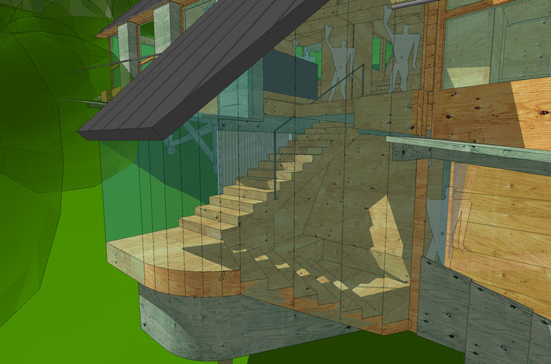
cloakroom and lobby
The structure responds to the under-slung access via a “mini-landslide” of the main roof – enabling a mostly-glazed entrance hall which’ll double up as a great place to catch the late afternoon sun while getting the most out of the available views. Just behind the front door is a cloak cupboard and bench-seat. We expect the inclined wall to have the facility to store hats / scarves / coats / boots / whatevers – we want to keep all that junk out of the main areas.
You’ll notice that all of these images show plywood used for just about everything – this is not simply 3d rendering fanciness – we want to use DD-grade plywood (thats the cheapest stuff available – yes, the one with all the holes in the outer veneers and is normally used for hoardings or bracing) and join all the bits very simply and directly (like staples or nail-gun). Inside and out as the primary finish. The green-grey coloured plywood is CCA treated (Copper Chrome Arsenate – a basic timber treatment required by regulation), and is used for all external walls and decks, while the more yellow colour represents the more natural looking LOSP treatment. We do not want to put any varnish, stain or oil on anything – we want the entire structure to naturally gain an ageing patina – the two plywood colours will eventually merge into a single warm silvery colour as UV radiation takes its toll. I look forward to the subtle variances along the way – some parts get more UV than others.
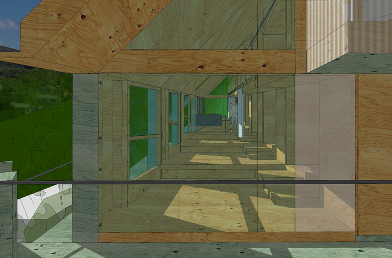
along axis looking north
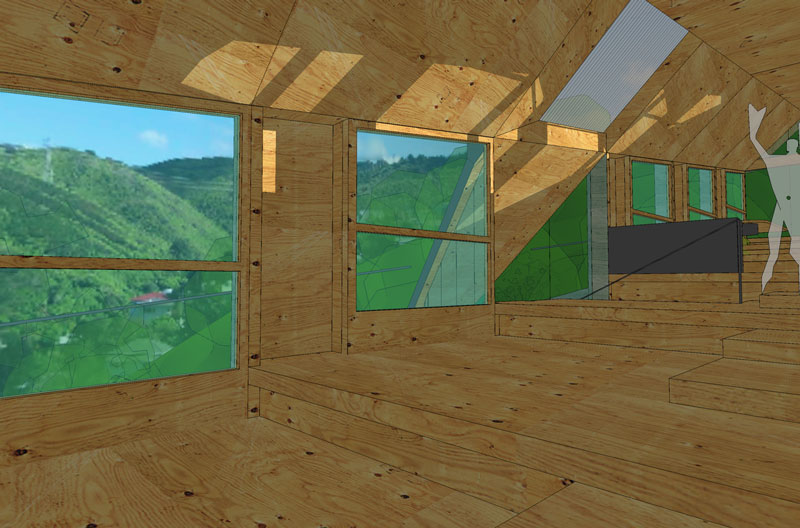
main view early morning winter sun (an aside: crappy lighting, must redo)
In the images above you’ll notice a fair amount of sunlight piling into the main space – this is uncharacteristic (the image was rendered to emulate late afternoon and early morning sun penetration). I’m keen to keep the main space largely free of direct sunlight – we plan to use it for studios, offices and workshops…
Each module in the main space is identical – bordered by bench-seats and serviced via smaller spaces huddled into the embankment.
Each module gets a large opening window wall on the view side – allowing access to a very slender external/ramp/deck. The deck is used primarily to allow us to clean the windows (and will be useful as a service gallery during construction). When a door is open it will stop itself against the handrail – and provide a protected-yet-sunny bench seat facing the view.
Not shown are the sliding paper screens which run parallel with the view wall (not shown ‘cos they’re technically a fitting and have not been resolved yet).
— giz 7825 days ago #