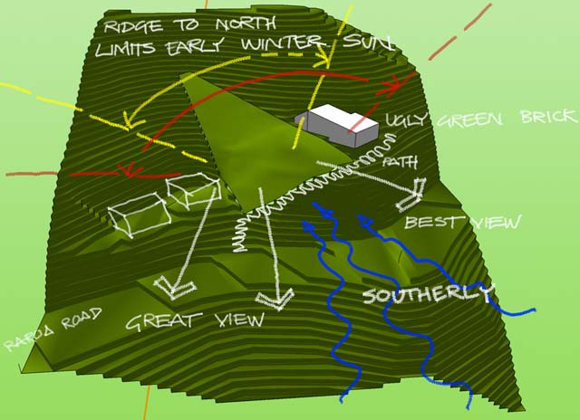
This 3d model of the valley is still missing some detail (like the houses along the top of the ridge (about 25m higher up from the uppermost reaches of the section)), but this should give you a reasonable idea of the issues impacting on the site.
The orange line denotes north-south.
The site is very steep in one direction (around 40°) and much gentler facing the best view (about SE).
The Big Design Issue is to keep the structure as high on the site as possible, so maximising the winter sun and lifting above the ugly green brick house. The contours and the narrowing site conspire with each other to force the design into something long and thin, preferably multiple levels cascading down the slope (= expensive).
Oh yeah. The entire site is also covered with dense trees and brush. I’d rather not fuck with these as they hold the entire slope together – we do not want to encourage mud-slides in these parts!

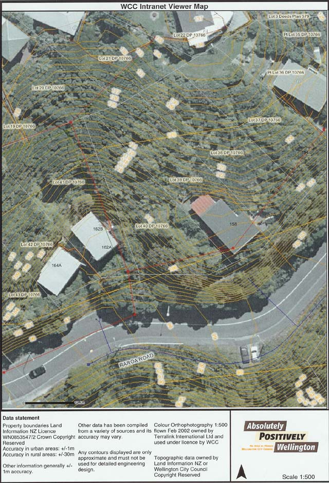
Council aerial photo (the legend distance bar at the bottom reads 12.5m)
— sean 7960 days ago #